Color Picker & Converter — HEX, RGB, HSL in Real Time + One-Click Palettes
Pick colors visually and convert HEX, RGB, and HSL in real time. Build harmonious palettes in one click with complementary, triadic, and analogous rules—built for modern design workflows.
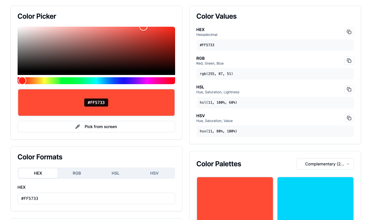
Color is the rare design decision that everyone notices—even when they can’t explain why something feels “off.” In production, though, color isn’t a vibe alone: it becomes numbers your team can share. HEX for fast handoffs, RGB for channels and alpha workflows, HSL for adjusting lightness and saturation without wandering away from the hue you already liked.
That’s why we built Color Picker & Converter as a single workspace: pick visually, watch values update in real time, then generate harmonious palettes using complementary, triadic, and analogous rules—so you can move straight into UI systems, brand work, or CSS with less friction.
→ https://atdev.blog/tools/color-picker
Why “picker + converter” belongs in one tool
A picker answers: what should it look like?
A converter answers: what do I ship?
In real teams, those are never truly separate. When conversions stay synced as you nudge hue/sat/lightness, you reduce rounding mistakes, avoid hand-retyping, and keep everyone aligned on the same source of truth.
HEX vs RGB vs HSL—what each is best at
HEX
Compact and universal. Great when you need one string that works everywhere from design notes to code snippets.
RGB
Channel-native. Helpful for alpha, blending, gradients, and pipelines where you think in additive components.
HSL
Hue, saturation, lightness. Often the fastest way to create consistent ramps (lighter/darker variants) while keeping the “character” of the base hue—especially when you’re sketching tokens before they become a formal design system.
See everything update together as you adjust — → https://atdev.blog/tools/color-picker
One-click harmony: complementary, triadic, analogous
Complementary
High contrast, strong tension. Useful for accents, calls-to-action, and emphasis—if you manage saturation so it doesn’t scream across the whole screen.
Triadic
Structured variety—three evenly spaced hues. Useful when you want energy and separation between sections without drifting into random rainbow territory.
Analogous
Neighbor hues on the wheel—often calmer, cohesive, and friendly for large UI surfaces, backgrounds, and brand moods that need to feel restrained.
Rule-based palettes don’t replace taste—but they replace blank-page randomness with a sane starting point you can refine with accessibility and brand constraints.
Practical workflows: UI, CSS, and brand kits
- UI states: hover/active/disabled variants are easier when your adjustments follow a consistent lightness/saturation logic.
- CSS tokens: copy the values you need in the format your stack prefers.
- Brand exploration: lock a hero hue, generate a coherent set of companions, then validate contrast for type and icons.
If you’re building a lightweight design system, treat this tool like a shared scratchpad before values harden in code
Common pitfalls (quick fixes)
- Trusting one screen forever: brightness and calibration differ—always check contrast for text and icons.
- Neon saturation everywhere: bold palettes are fun; large fields often want softer saturation strategies.
- Too many accents competing: complementary colors punch—use them with intention.
Conclusion
Good color work is part intuition, part engineering: you need accurate values, coherent relationships, and a workflow that doesn’t break when someone asks for “the same blue, but readable on white and charcoal.” A combined picker and converter—plus palette rules—makes that loop faster, cleaner, and easier to collaborate on.
→ https://atdev.blog/tools/color-picker
1) What does a color picker and converter do?
It lets you select a color visually and copy numeric values in common formats—typically HEX, RGB, and HSL—with values updating together as you adjust the color.
2) Why use HSL instead of HEX in CSS?
HSL can make it easier to adjust lightness and saturation predictably while preserving hue, which helps when building consistent shades for UI states and tokens.
3) What is a complementary color palette?
It’s based on two hues opposite each other on the color wheel, often producing strong contrast useful for accents—if used carefully for accessibility and visual balance.
4) What is a triadic palette?
It uses three hues spaced evenly around the wheel, giving a vibrant but structured starting point for multi-color designs.
5) What is an analogous palette?
It uses neighboring hues on the wheel, often feeling cohesive and calm—useful for backgrounds and subdued brand aesthetics.
6) Are generated palettes guaranteed to be accessible?
Not automatically. Always check contrast ratios for text and icons against your backgrounds and adjust saturation/lightness as needed.